
I was in the process of job interviews this past summer for Product Designer roles. And of course it involved a Product Design Exercise.
The assignment? Pick an app you use everyday and critique it. Point out their competitors, explain the product, and highlight what’s wrong. I chose Mint since I use it every day.
That was phase one. Phase two was to solve for the problems I surfaced. What I found ironic was that Mint soon thereafter did introduce a redesign with some similarities between their choices and mine.
I’ve decided to share those designs and my thought process with you here.
Download the PDF with my Problem Discovery (Part One) and Suggested Solutions (Part Two).
How I Use Mint

I’ve never been great with my personal finances. It’s a personal flaw I’ve come to accept. However, to try and counteract this poor life skill and keep track of my finances, I use the Mint app every day. I even have the Mint app icon located closer to the bottom of my iPhone screen so my thumb doesn’t have to stretch too far to reach it (I call it habit hacking). The number one thing I’m interested in knowing day to day is whether I’m sticking to my budget or not.
About Mint
Mint is an app that simply helps you manage your money from bills, to budgets, credit scores, and more
Mint targets young professionals because they spend so much time online
Mint built their brand on trustworthy, financial advice and content through their blog MintLife
They met their audience where they spent the most time (online)
Intuit bought Mint.com in 2009 for $170 million
Since 2007, Mint has gained more than 10 million users
“That was the idea behind Mint. Make it dead simple to get your finances in order and to feel in control of your life.”
To Feel In Control of Your Life
This part of the founder’s quote really stood out to me. Their mission was clear. Yes, Mint is a personal finance tool. But the point of the tool isn’t just to have it and forget it. It’s to feel in control of your life. And it was a key area of opportunity I felt the Mint app could really capitalize on.
But first I wanted to point out the positive. These are some of my favorite features.
Budgeting
With just a glance, I know if I’m financially on track or not
When I click through for more details, I get category specific updates
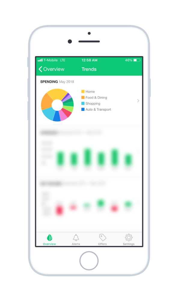
Spending and Trends
I can compare how much I spend in each category with a simple chart
I can compare how much I spend month to month
I can compare my net income month to month
Credit Score
I receive regular updates on my credit score
I immediately know if it’s good, bad, or just okay
I know why my score is what it is

Budgeting
Spending and Trends

Credit Score
So what’s missing?
To feel in control of your life. The app offers so much information, and it’s all on one screen and I have to click through in so many places. Sometimes it can be overwhelming and make my finances feel more chaotic than controlled. And why is that?
Feature Bloat
Mint has so many features they try to surface to their users, they forget to ask which might be the most important. Here’s what they show on one screen out of four, with no visual hierarchy:
The apps home screen opens to an Overview page which displays:
Transactions (including your 3 most recent)
Suggested offers (how they make money)
Your account balances (cash, debt, investments)
Upcoming bills
Credit score
Budget progress
Spending chart
Cash flow
Blog
What does problem solving actually look like?
So I have to ask. Is this control?
When your product gets so bloated, it’s important to keep some perspective. What question are Mint’s users trying to answer when they first open the app? What actions are they trying to take? What’s their real problem? What does control mean to the user?
It could mean a variety of things:
Am I over budget yet?
Can I buy this?
Do I have upcoming bills?
Did that transaction go through?
How’s my credit score?
Can I afford life? (this is actually the title of my budget)
Answering the most important question faster gives your users control.
So what did I suggest?
Determine the single biggest problem a user has when they open the app
Redesign the app’s dashboard experience to surface the feature that solves that problem fastest
Customize future versions based on users’ behavior to better solve for individual users’ problems
Who does it best?
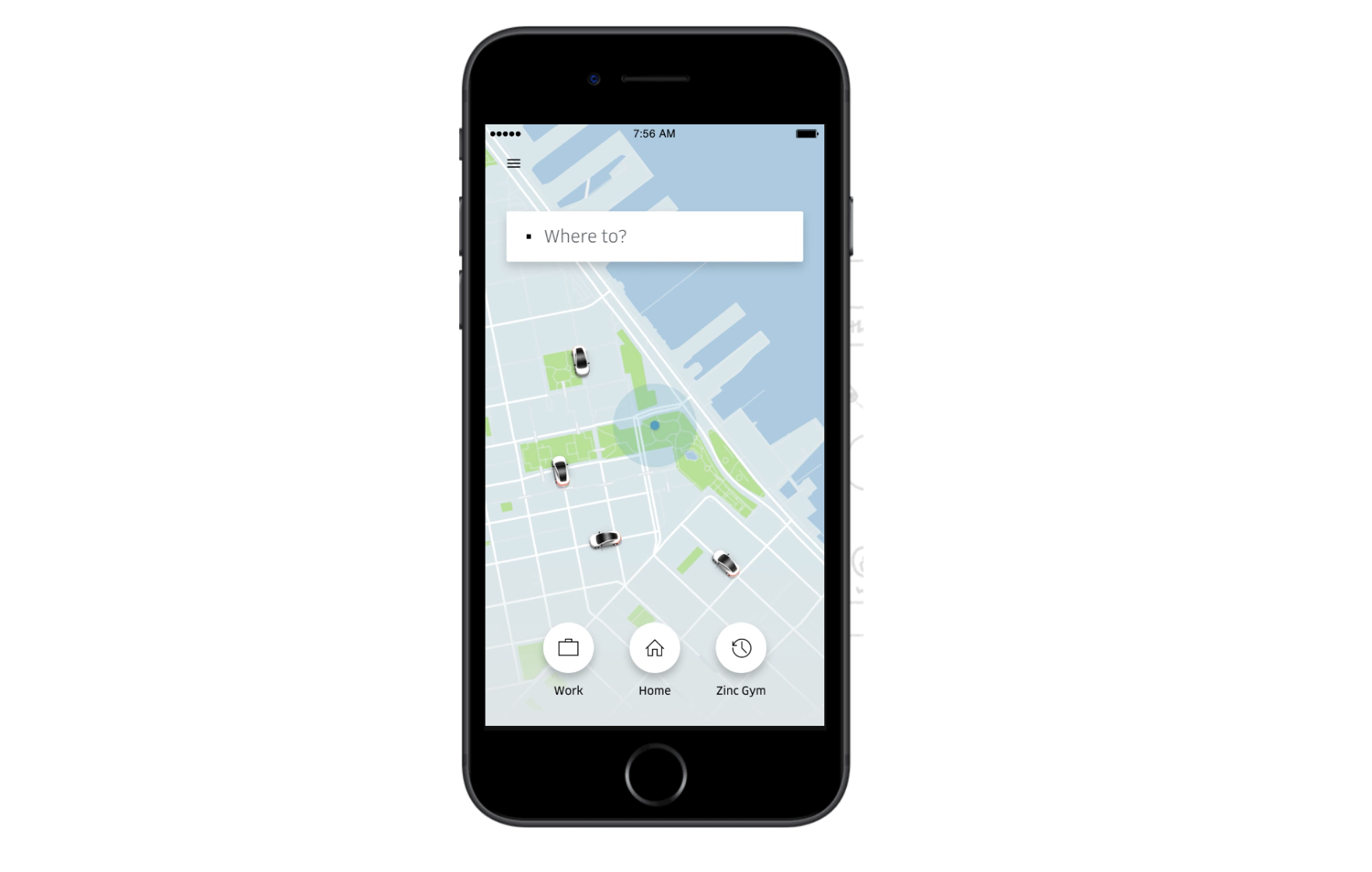
Uber does it best.
Uber’s first concern is to solve your biggest problem when you open that app. Where to? Simple. Concise. Useful. I think all products should aim to provide the same, simple sort of solutions for their users.
My Hypotheses
When I’m going into solution mode, I like to think about how to measure for success. So I compiled a few different ideas and formatted them into hypotheses.
Idea One
Hypothesis:
I believe that by adding a home screen to Mint’s app that highlights one key piece of information custom to each user, Mint can empower users to gain better control of their finances and increase mobile app engagement. Measured by:
- Product feature adoption / usage
- Daily active users
Idea Two
Hypothesis:
I believe that by adding a month over month budget graph and analysis, Mint can empower users to gain better control of their finances and increase mobile app engagement. Measured by:
- Product feature adoption / usage
- Daily active users
- Reduce % of users over budget
Idea Three
Hypothesis:
I believe that by analyzing users’ progress and specific struggles with budgeting, and showing more advice, ways to save, and offers within the app experience, Mint can empower users to gain better control of their finances and increase offer acceptance. Measured by:
- Offer conversion rates
- Credit score over time
Idea Four
Hypothesis:
I believe that by integrating Siri voice technology for financial progress updates, Mint can empower users to gain better control of their finances, reduce friction, and mobile app engagement. Measured by:
- Product feature adoption / usage
- Daily active users
“Hey Siri, how much do I have left in my food budget this month?”
These were a few ideas I felt could really push the app into becoming a more useful tool. These features could help the users gain control through frictionless information delivery.
Keep, start, stop
An idea I’ve taken from jobs in the past is this concept of determining what’s working, what isn’t working, and what should we start doing? So I made sure to collect these ideas, as well:
Keep
Playful messaging
Overview page
Color graphs
Simple design
Financial advice
Start
Highlight main action per page
Make refresh action visible
Receipt photo tracking
Stop
Irregular app patterns (no menu bar, hidden refresh, exposed settings)
The solutions and design decisions are summarized in this PDF.